Project Type:
Web Application Design
Programs Used:
Illustrator
Photoshop
VS Code
GitHub
Role: UX/UI Designer, Brand Designer
Deliverables: Logo, Brand Guide, Responsive Web Application, UI Design System
______________________________________________________________________________
The Problem:
People relocating to a new area often need to gather information from multiple websites to learn about local services, community resources, safety, schools, transportation, and other essential information. This fragmented experience can be time-consuming and overwhelming, particularly during an already stressful moving process.
The goal of Neighborhood Navigator was to create a centralized digital resource that helps users quickly access reliable information and make informed decisions about the communities they are considering.
__________________________________________________________________________
Research & Brand Identity:
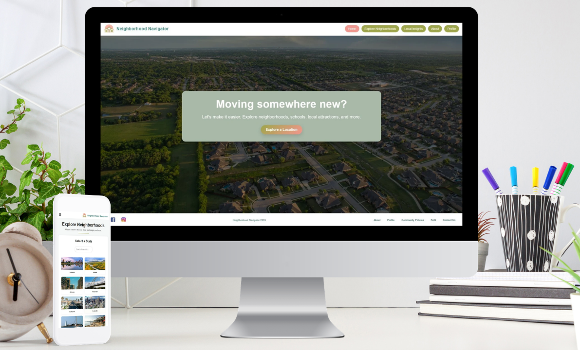
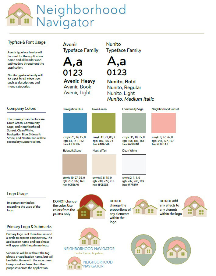
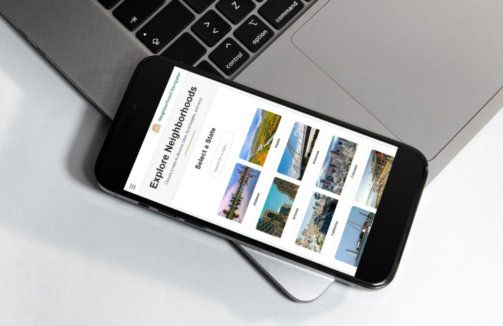
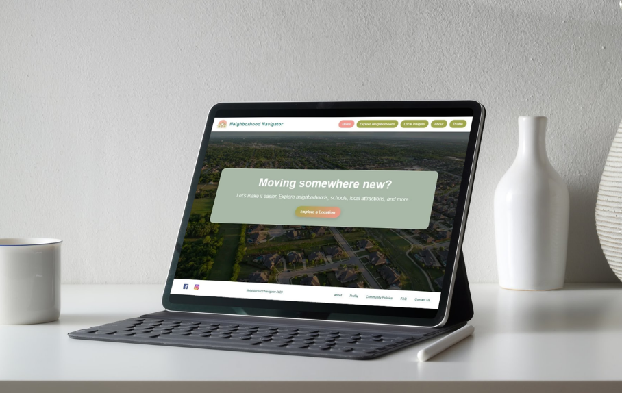
I developed Neighborhood Navigator, a responsive web application designed to bring essential community information into a single, easy-to-navigate platform. As part of the project, I created the brand identity, including the logo, color palette, typography system, and brand guidelines to establish a trustworthy and approachable experience.
UX/UI Solution:
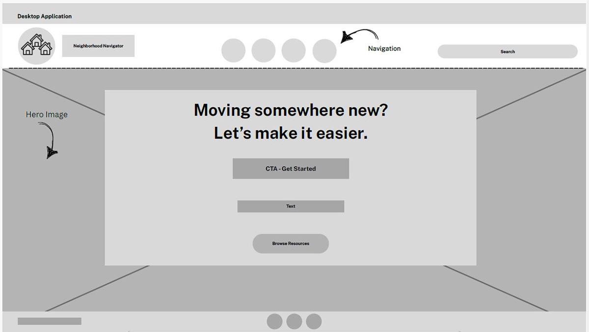
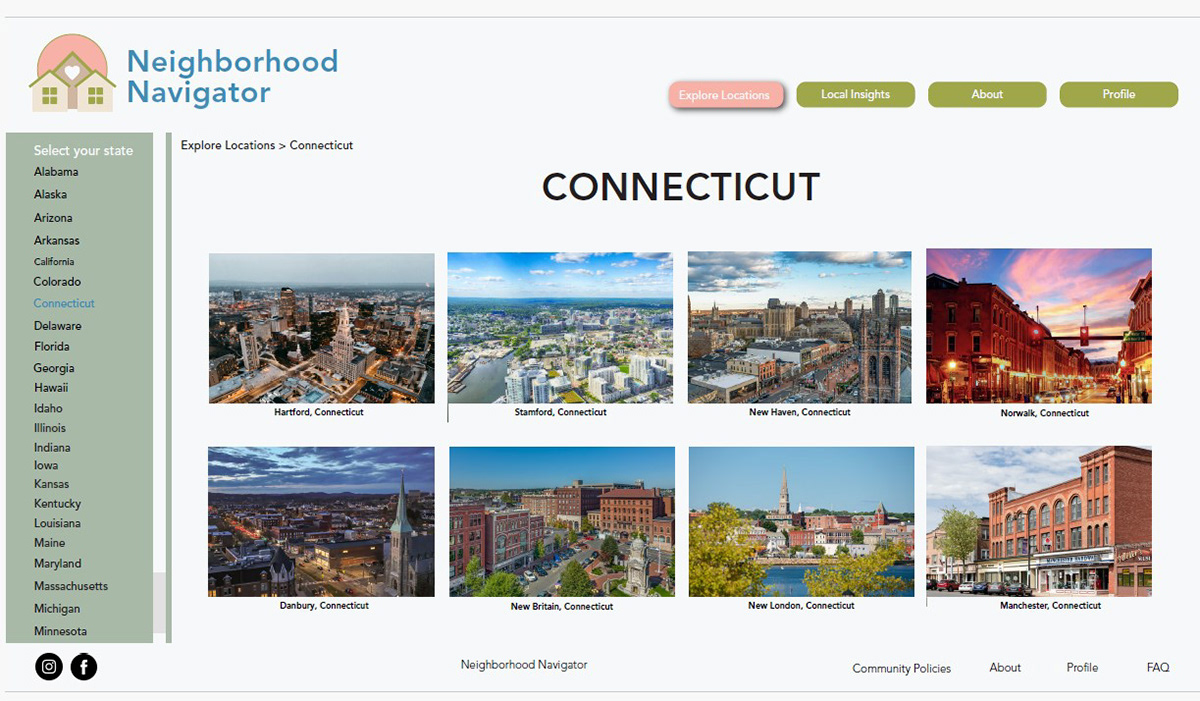
Neighborhood Navigator was designed to reduce friction in the relocation research process by centralizing essential information within a single, user-friendly platform. Information architecture played a key role in the design, with content organized into logical categories that allow users to quickly navigate between resources without becoming overwhelmed.
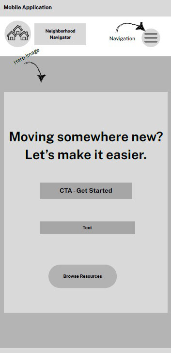
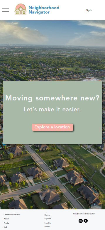
The interface leverages visual hierarchy, consistent navigation patterns, and responsive layouts to support efficient information discovery across devices. Accessibility considerations such as readable typography, sufficient color contrast, clear labeling, and inclusive language were incorporated to create a more equitable user experience. Combined with a cohesive visual identity and thoughtfully designed interactions, the application provides users with a reliable and intuitive resource for exploring and evaluating new communities.
_____________________________________________________________________________
_____________________________________________________________________________
Impact:
Neighborhood Navigator streamlines the research process for individuals preparing to move by reducing the need to visit multiple websites or conduct numerous searches. By organizing relevant local information into a single platform, the application supports informed decision-making and improves access to community resources.
The long-term vision for the product is to become a trusted resource that users can rely on for accurate, up-to-date information before and after relocating to a new area.
______________________________________________________________________________

Logo Design
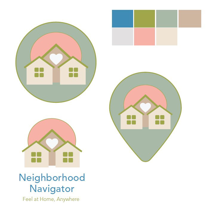
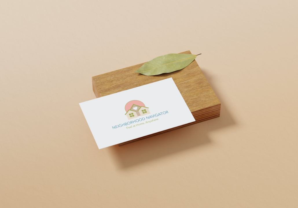
The logo features three houses within a circular form to symbolize neighborhood connectivity and community. The circular background suggests unity, inclusion, and belonging, reinforcing the idea that Neighborhood Navigator helps users feel at home wherever they go. A subtle heart symbol at the center represents care, comfort, and emotional connection — emphasizing that this platform is about more than location data; it is about helping users feel supported during a meaningful transition.
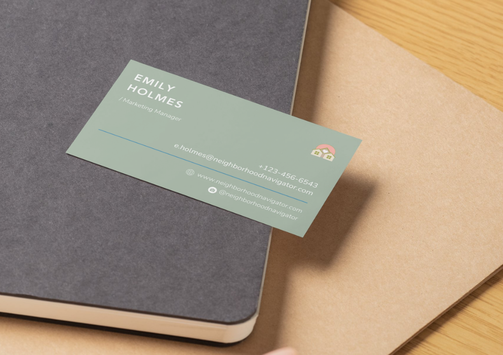
Simplicity was a guiding principle in the design process. The logo was intentionally kept clean and minimal to ensure clarity and scalability across various applications, including business cards, mobile app icons, website headers, social media platforms, and promotional materials. The result is a versatile and recognizable mark that remains effective at both large and small sizes